+56% improvement in onboarding readiness

PROBLEM
Inconsistent onboarding resources created confusion and slowed new starter productivity
ROLE
Research synthesis, journey mapping, information architecture, UI & content design
CHALLENGES
9 teams with conflicting priorities, existing resource dependency, conflicting persona needs, leadership requirements
OUTCOMES
Improved onboarding readiness by 56%, 2 independent teams created contextual version
UNDERSTANDING THE PROBLEM
Inconsistent onboarding experiences affected day-to-day work
Early conversations surfaced the problem stemmed from inconsistency - new starters received different levels of guidance depending on team structure, which affected confidence and productivity in the first weeks.
Sequential 1-1 interviews with 10 new starters across 6 teams narrowed down key themes where inconsistencies lay across.
People & Support
Logistics & Set-up
Resources & Structure
Culture & Confidence
ANALYSIS & PRIORITISATION
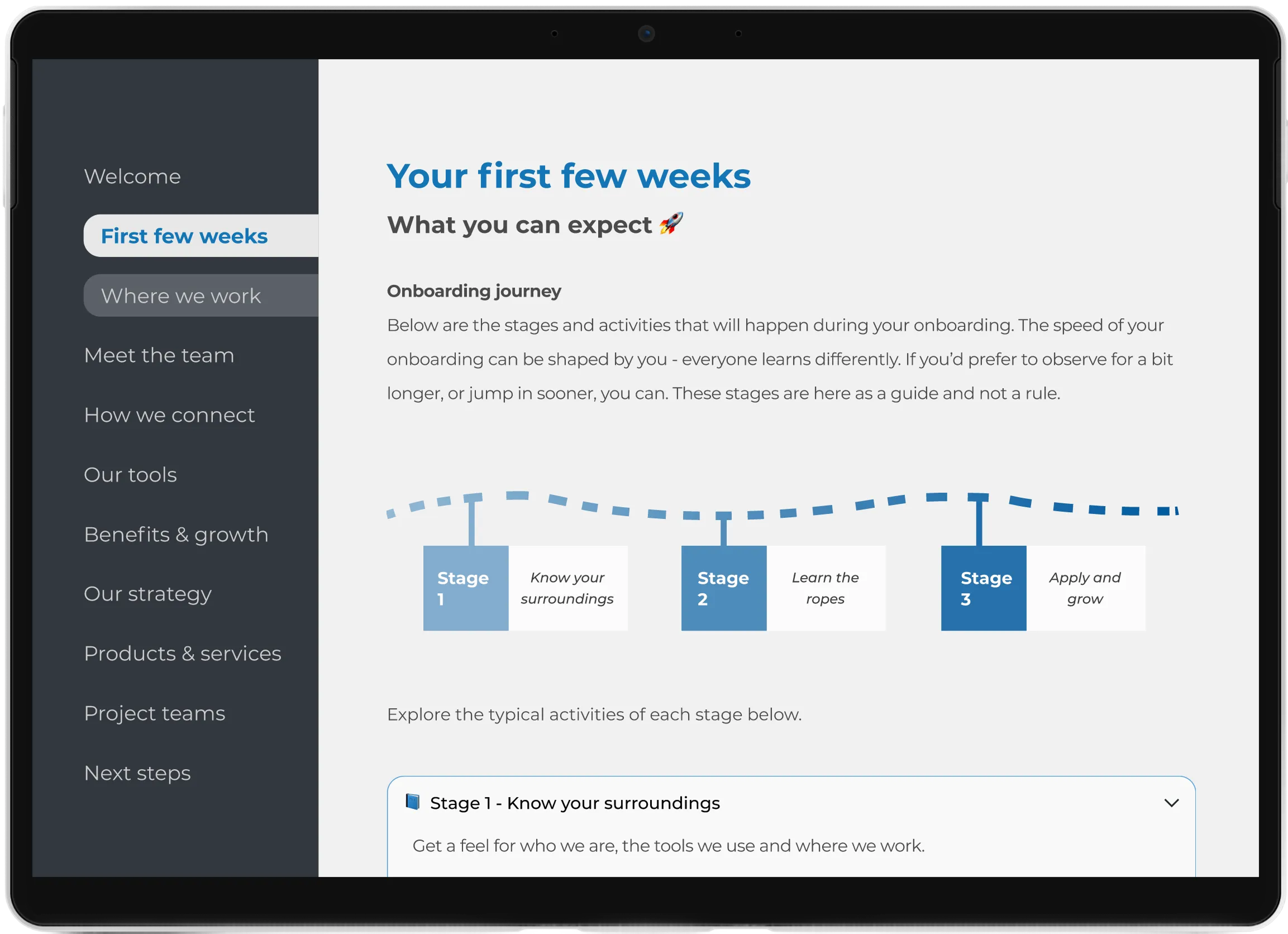
I mapped the onboarding journey from pre-start to Week 2. This revealed that friction clustered around resource delivery and structure, particularly when informal support wasn’t available.
Resources & Structure emerged as the biggest friction point
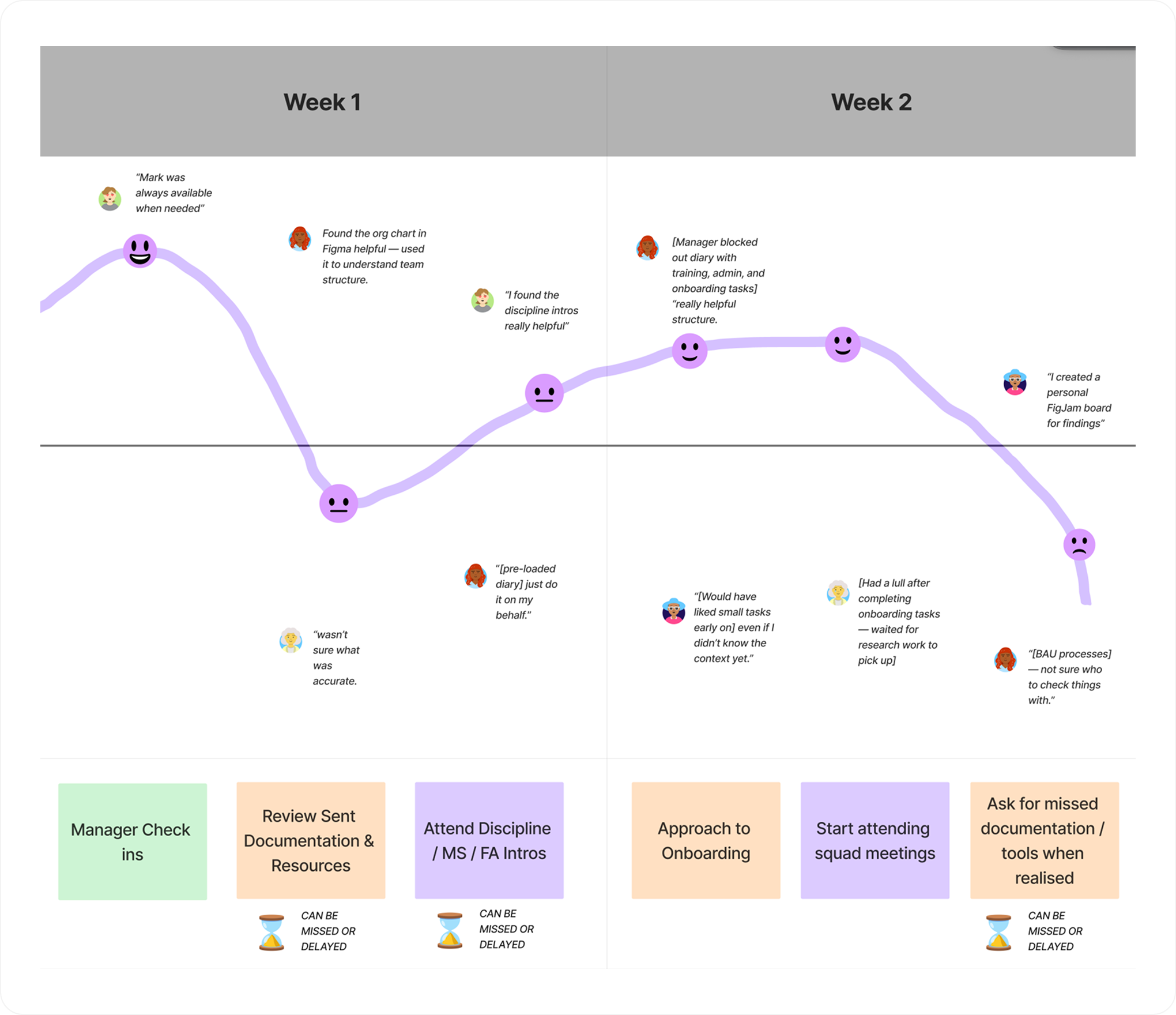
A quantitive assessment matrix (which scored each user across each onboarding activity), revealed “Resources and Structure” as the lowest at 51/100. I narrowed my scope to focus on this area within the project’s time constraints, and provided a baseline metric to test improvement.
USER INSIGHTS
Research revealed distinct onboarding needs
While users experienced similar onboarding challenges, their need for structure and guidance varied significantly.
A fully standardised onboarding journey risks slowing experienced joiners, while a self-directed approach leaves others unsure of expectations. A solution needed to provide a consistent foundation while allowing flexibility for different levels of autonomy.
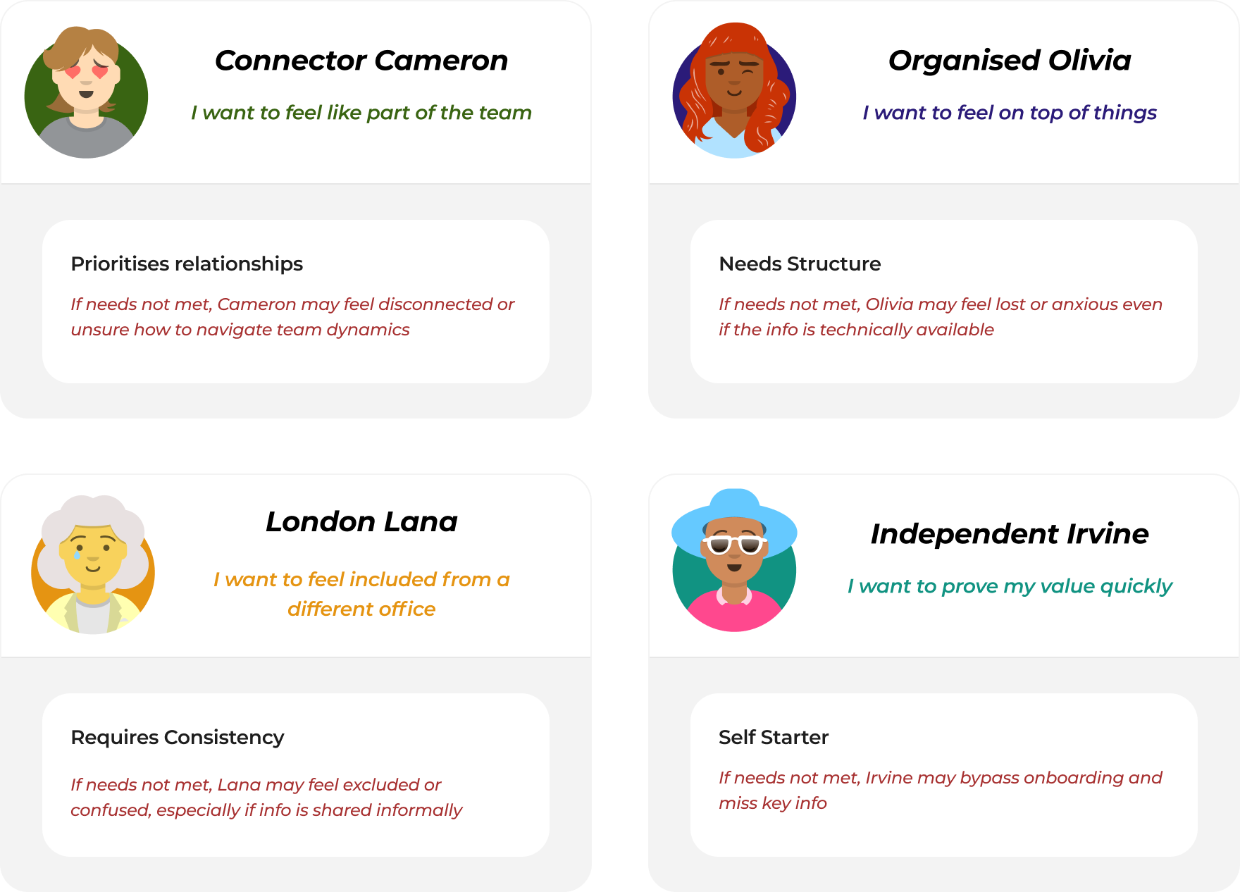
Excerpt: Four lightweight archetypes summarised the different learning onboarding learning styles from research
CONCEPT EXPLORATION
A single, flexible model best supported different onboarding needs
Two main concepts emerged through user flows assessing flow and friction points - either a centralised resource delivery, or improving the existing personalised onboarding checklist. Friction with the existing method lay in reliance on tool licence, and memory to duplicate and send a personalised version.
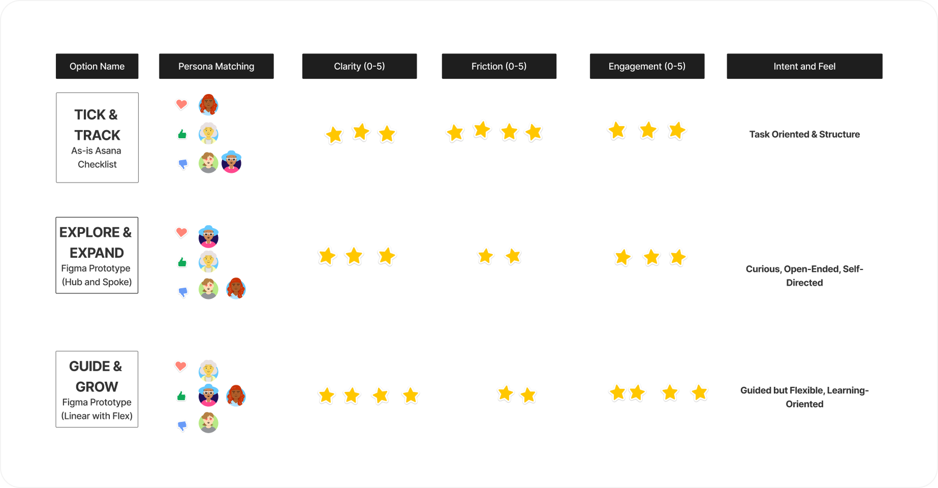
The resource-model delivery format was the most flexible to suit all archetype needs. I chose to create it as a Figma prototype to test a hypothesis that a structured, interactive model would improve clarity and drive higher engagement. Additionally,
PROTOTYPING & VALIDATION
Early testing exposed friction in content and pacing
Low-fidelity prototypes helped experiment with structure, content and tone. Using Figma Make allowed me to rapidly test ideas and validate the “linear with flex” model over a hub-and-spoke approach - keeping decisions simple - whilst still suiting autonomous users and returners.
Alignment through a Crit and a resources workshop with recent new starters helped find the balance between user expectations and current available resources. I designed sections and resources based on relevancy across all teams, critical information for a new starter, and availability, to avoid the guide being diluted and losing trust with the user.
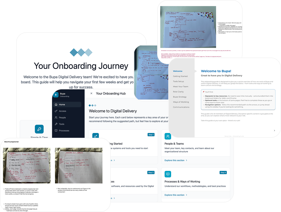
FINAL DESIGN
Refining the structure to reduce cognitive load
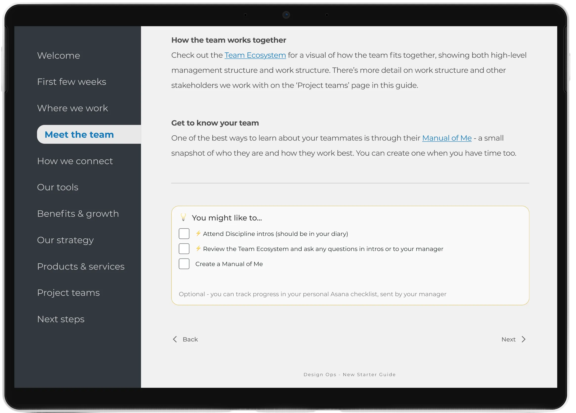
Key design decisions included:
a calm, minimal entry point showcasing tone and brand
accessibility checks for guided colour contrast
side-nav over progress bar, to reduce friction for revisits
accordions for dense content, if not relevant for all
checklists for guidance of suggested tasks
OUTCOMES & REFECTION
New starters reported clearer expectations and understanding
Outcomes
A 56% increase on the “Resources and Structure” score, improving from 51 to 80 following implementation.
The onboarding template was organically adopted by 2 other teams (1 internal; 1 external), illustrating ease of customisation, and relevancy of chosen artefacts
Positioning the tool as a Figma prototype over a static guide was validated through user feedback and cross-team adoption.
Reflections
Future iterations will focus on identifying remaining learning resource gaps and improving long-term maintainability.
The interactive format enabled experimentation, but scaling further would require clearer version control and ownership across teams.
Reduced user licence request time from ~5 days to 90 mins
Redesigned the licence request experience by introducing clearer decision guidance, structured request flows and lightweight automation to reduce accidental requests and improve approval speed