Simplifying deep navigation in workout tracking app
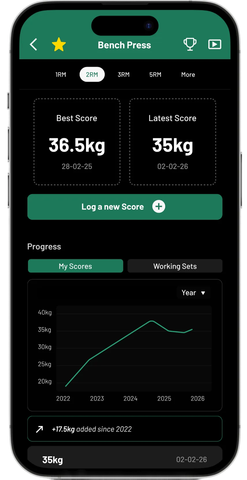
After
Before
PROBLEM
Hidden navigation impacted discoverability of exercises and rep variations within
ROLE
Personal Project - UX Designer
SCOPE
Information architecture, user flow mapping, competitor analysis, UI redesign, accessibility
OUTCOME
Guerrilla testing increased speed of discoverability and more confidence for athletes
PROBLEM FRAMING
Introducing Boxmate
Boxmate is a CrossFit exercise app for booking classes, logging and tracking exercises and connecting with your local community. This project focused on improving navigation and discoverability around exercise pages and rep-specific logging, based on real frustrations observed during day-to-day training.
This is a concept redesign focused on informal conversations with existing users, UI heuristics, competitor analysis. Further work could include usability testing, additional score types and edge cases.
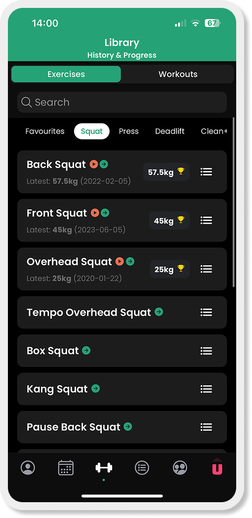
Excerpt: Snapshots from the current Boxmate app, showing exercise list and landing page
INFORMATION ARCHITECTURE
The problem isn’t logging - it’s getting to the right exercise landing page
Through day-to-day training, users often struggle to find rep variations (e.g. 2 rep max) despite coaches assuming this is “easy”. This mismatch highlights a gap between the system’s structure and users’ mental models.
A local IA shows how users currently land on exercise pages, and where rep-specific logging becomes hidden or fragmented across the journey.
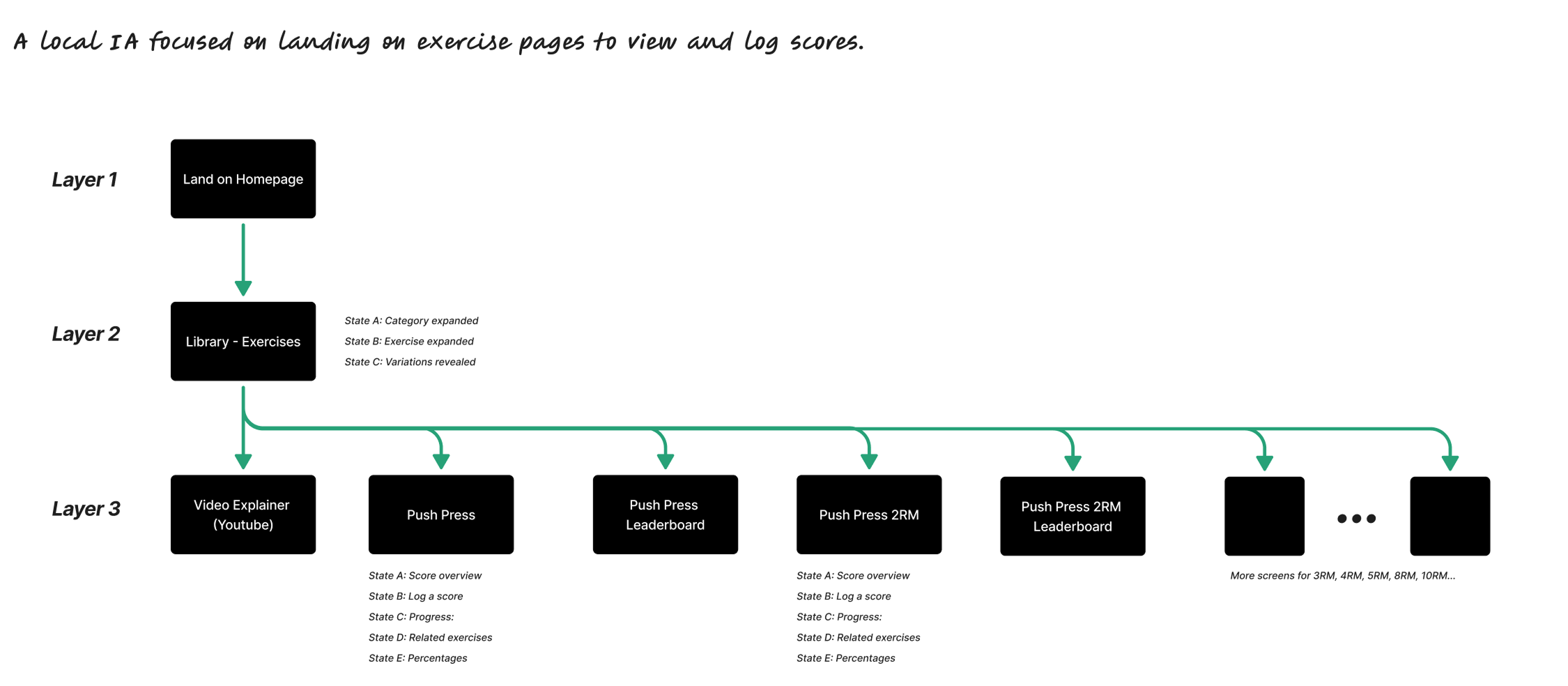
Excerpt: Local information architecture showing navigation to exercise pages and rep-specific score states
USER FLOW
Interaction analysis revealed breakdowns in discoverability and hierarchy
Analysis of the 2RM logging journey exposed structural issues in how actions and rep variations were surfaced, making it difficult to predict where scores lives.
Discoverability relied on hidden or secondary controls, increasing navigation depth
Primary actions competed with supporting content, diluting hierarchy
Rep variations lacked a clear mental model, fragmenting content and weakening decision clarity
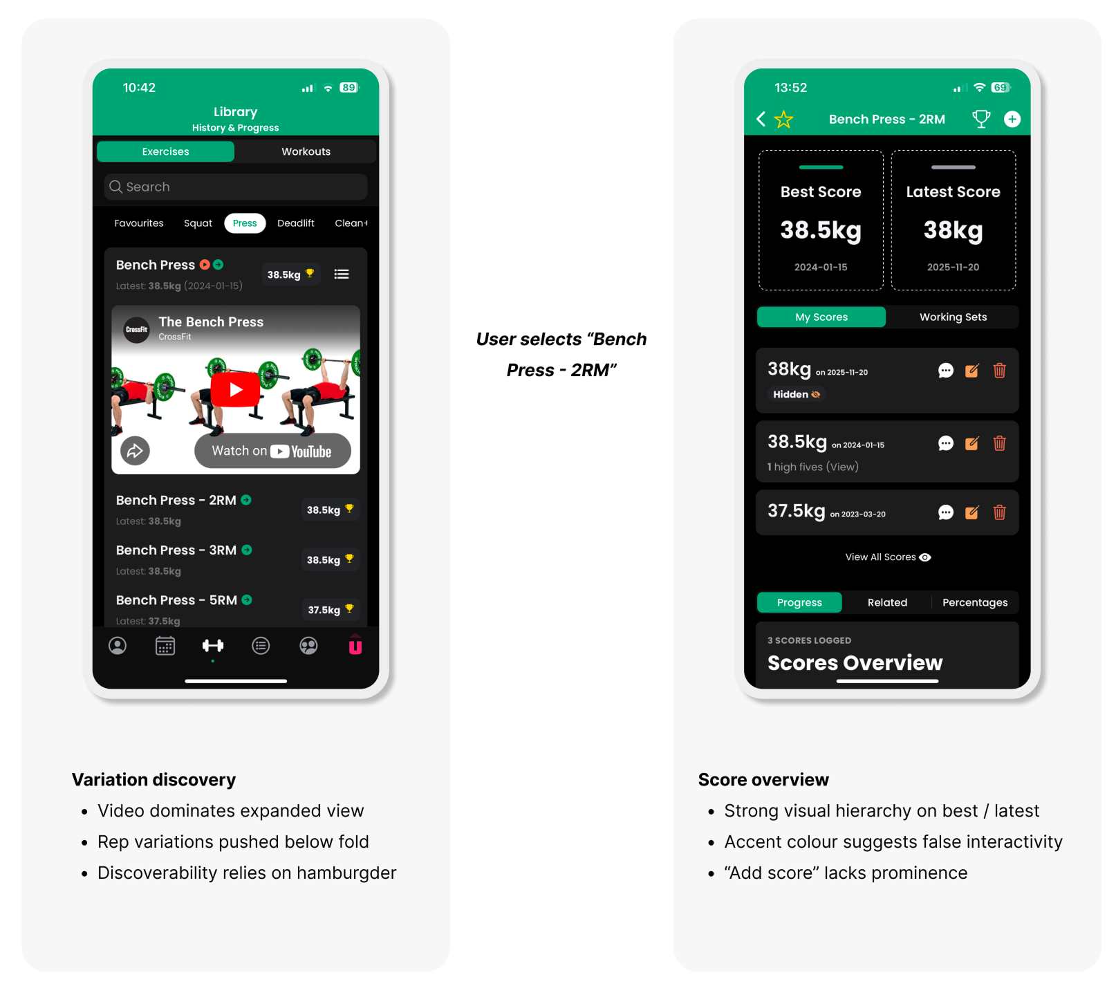
Excerpts: Examples of heuristic analysis across the 2RM logging journey
INTERACTION ANALYSIS
How workout apps support discovery and decision-making
I analysed comparable workout apps to understand how users discover exercises, interpret variations and log scores. Clarity emerged through consistent affordance patterns, reduced choice at the point of action and clear separation of purpose between screens.
This informed the principles of design moving forward:
Clear purpose per screen - each area supports a single intent
Grouped mental models - rep variations live within the same exercise content
Reduced competing actions - minimising toggles, duplicate entry points and alternate flows
DESIGN DIRECTION
Prioritising clarity, accessibility and primary actions
The redesign focuses on prioritising clarity and primary actions within the exercise flow. Exercise pages were reconstructed to surface past performance first, support selection of rep variation and make logging a clear primary action. This reduced navigation depth and removed competing entry points. I reviewed accessibility and slightly amended brand colours to meet WCAG AA guidelines through colour contrast.
Live demo - explore the Bench Press 2RM flow
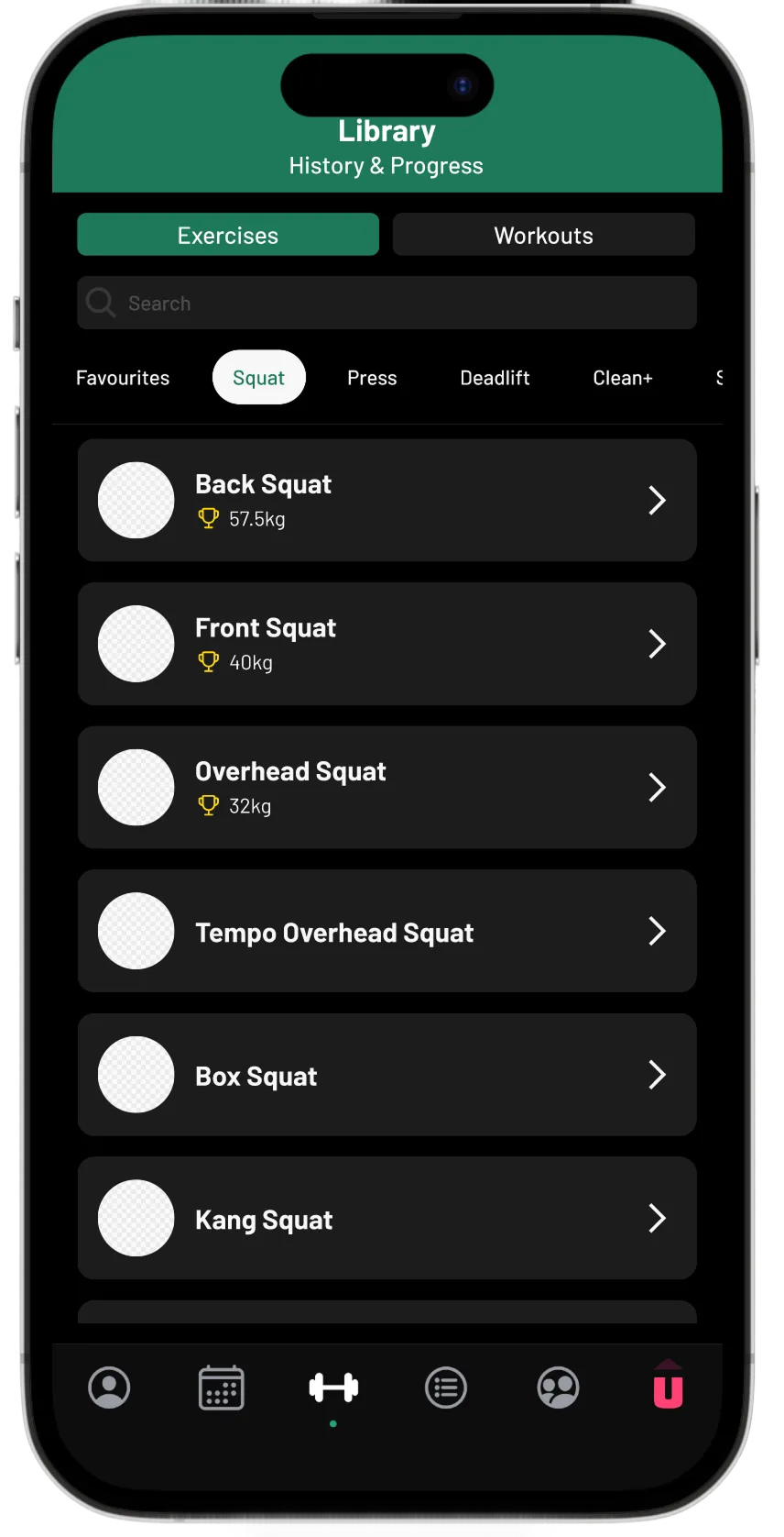
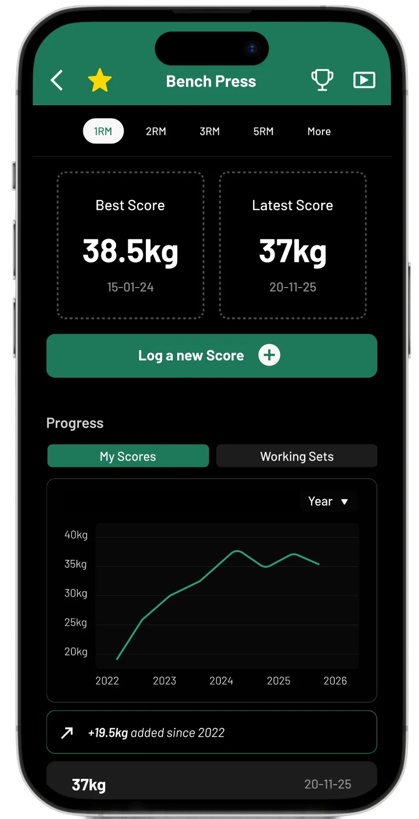
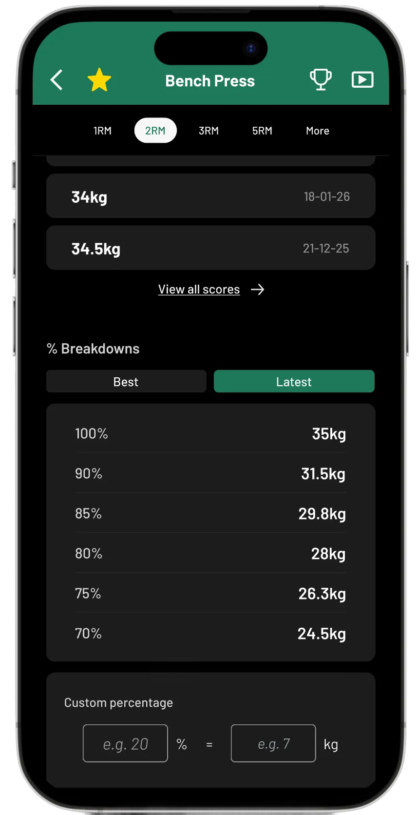
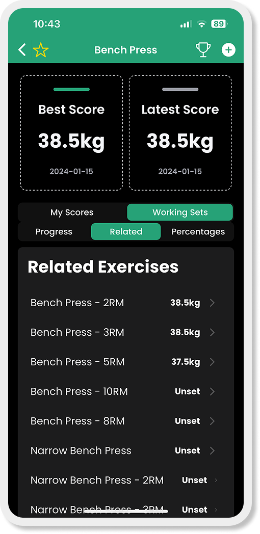
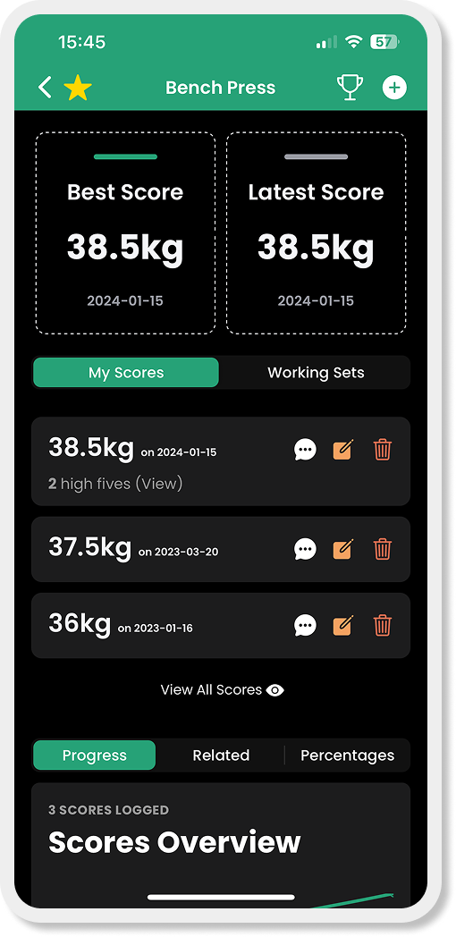
Excerpts: Final UI showed improved exercise discovery, clearer rep variation switching, and a simplified breakdown of scores
OUTCOMES AND REFLECTION
Usability testing and iterations
Guerilla testing of early sketches with a coach and an athlete validated the core interaction model before prototyping. More structured live usability testing is currently in progress with other athletes. (Feb ‘26).
This aims to test mental models, determine any edge cases and further accessibility testing including touch targets and one-handed use post workout